Case Study 5: Forest Area Monitoring Over Time
Using a time-series of Landsat imagery to quantify forest loss and gain between two periods and visualize the net change.
Introduction to Forest Change Detection
Understanding forest dynamics requires more than a single snapshot; it requires monitoring changes over time. **Change detection** is the process of identifying differences in the state of an object or phenomenon by observing it at different times. In forestry, this allows us to map and quantify both **forest loss** (deforestation) and **forest gain** (reforestation or afforestation). By classifying land cover maps from two different years and comparing them pixel by pixel, we can create a powerful analysis that highlights exactly where changes have occurred. This information is critical for national carbon accounting, evaluating conservation policy effectiveness, and understanding landscape-level ecological shifts.
Analysis Workflow
1. Create Annual Composites
Define an Area of Interest (AOI) and create two cloud-free median composites from Landsat 8 imagery for the start year (2014) and end year (2024).
2. Train a Single Classifier
Using ground truth points, train a single classifier (e.g., CART) on the most recent image (2024) to ensure the model understands the current landscape.
3. Classify Both Images
Apply the single trained classifier to both the 2014 and 2024 images to produce two comparable forest/non-forest maps.
4. Detect and Quantify Change
Compare the two classified maps to identify pixels that changed from forest to non-forest (loss) and non-forest to forest (gain). Calculate the total area for each category.
5. Visualize and Chart Results
Display the loss and gain layers on the map. Create a bar chart to visualize the total areas of gain, loss, and the overall net change.
Map Visualization
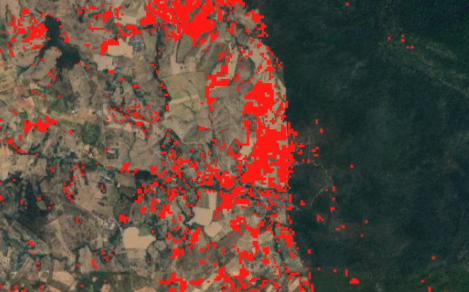
The final map highlights the areas of change between 2014 and 2024. Areas of **forest loss** are shown in **red**, while areas of **forest gain** are shown in **blue**. This provides an immediate visual summary of deforestation and reforestation hotspots.
GEE Code Snippet
This script classifies forest cover for two different years using a single classifier, compares the maps to detect change, and charts the results.
// NOTE: You must provide your own 'forest' and 'nonforest' FeatureCollections.
var l8 = ee.ImageCollection("LANDSAT/LC08/C02/T1_TOA");
var aoi = ee.Geometry.Polygon(
    [[[101.777, 14.536], [101.777, 14.304], [102.084, 14.304], [102.084, 14.536]]], null, false);

function getLandsat(year) {
  return l8.filterBounds(aoi)
    .filterDate(ee.Date.fromYMD(year, 1, 1), ee.Date.fromYMD(year, 12, 31))
    .filter(ee.Filter.lt("CLOUD_COVER", 5))
    .median().clip(aoi)
    .select(['B2','B3','B4','B5','B6','B7'], ['Blue','Green','Red','NIR','SWIR1','SWIR2']);
}
var image2014 = getLandsat(2014);
var image2024 = getLandsat(2024);

// Train classifier on 2024 data.
var training = image2024.sampleRegions({
  collection: ee.FeatureCollection([forest, nonforest]),
  properties: ['landcover'], scale: 30
});
var classifier = ee.Classifier.smileCart().train({
  features: training, classProperty: 'landcover', inputProperties: image2024.bandNames()
});

// Classify both images.
var classified2014 = image2014.classify(classifier);
var classified2024 = image2024.classify(classifier);

// Detect changes.
var forestLoss = classified2014.eq(1).and(classified2024.eq(0)).selfMask();
var forestGain = classified2014.eq(0).and(classified2024.eq(1)).selfMask();

// Calculate area and create a chart.
function calculateArea(image, label) { /* ... (area calculation logic) ... */ }
var areaLoss = calculateArea(forestLoss, "Forest Loss");
var areaGain = calculateArea(forestGain, "Forest Gain");
var netChange = ee.Feature(null, {
  category: "Net Change",
  area_km2: ee.Number(areaGain.get("area_km2")).subtract(areaLoss.get("area_km2"))
});
var chartData = ee.FeatureCollection([areaGain, areaLoss, netChange]);
var differenceChart = ui.Chart.feature.byFeature(chartData, 'category', 'area_km2')
  .setChartType('ColumnChart')
  .setOptions({title: 'Forest Change (2014 - 2024)', vAxis: {title: 'Area (km²)'}});

// Display results.
Map.setCenter(101.93, 14.42, 11);
Map.addLayer(forestLoss, {palette: "red"}, "Forest Loss");
Map.addLayer(forestGain, {palette: "blue"}, "Forest Gain");
print(differenceChart);
Analysis & Results
The analysis produces two key outputs: a spatial map of change and a quantitative chart. The map visually identifies hotspots of activity, with **red pixels** indicating areas that were forested in 2014 but are no longer forest in 2024. These are critical areas of deforestation. Conversely, **blue pixels** highlight areas of reforestation or afforestation, where tree cover has been established.
The **bar chart** provides the crucial quantitative summary. It shows the total area (in square kilometers) of both forest loss and forest gain over the 10-year period. The "Net Change" bar gives the final verdict: if it is positive, there was a net increase in forest area; if it is negative, there was a net loss.
This combined qualitative (map) and quantitative (chart) approach is extremely powerful for forest management. It allows stakeholders to not only see where deforestation is happening but also to understand the magnitude of the problem. This data can be used to report to international bodies like the FAO, verify the success of conservation projects, and direct law enforcement or resources to areas experiencing the most significant forest loss.